top of page


RockAway Record Store Website Design
Project Summary This project focusing on design a record store’s website with a refreshed vintage aesthetic that merges nostalgia with modern usability. The goal is to create a visually engaging interface that honors retro design principles while maintaining contemporary functionality. A key focus of the project is to reimagine how records are presented—developing a more dynamic, intuitive, and visually compelling method of showcasing the collection to enhance user engagement and browsing experience.
Wireframe


Mood Board


Home Page
Color Palette

FBC01A
E67010
Color inspired by The Beatles Magical Mystery Tour color palette.
8AB8DC
EF1921
41BCDE


Element design inspired by vinyl covers. Users can click on the cover to see more detailed information of the records.
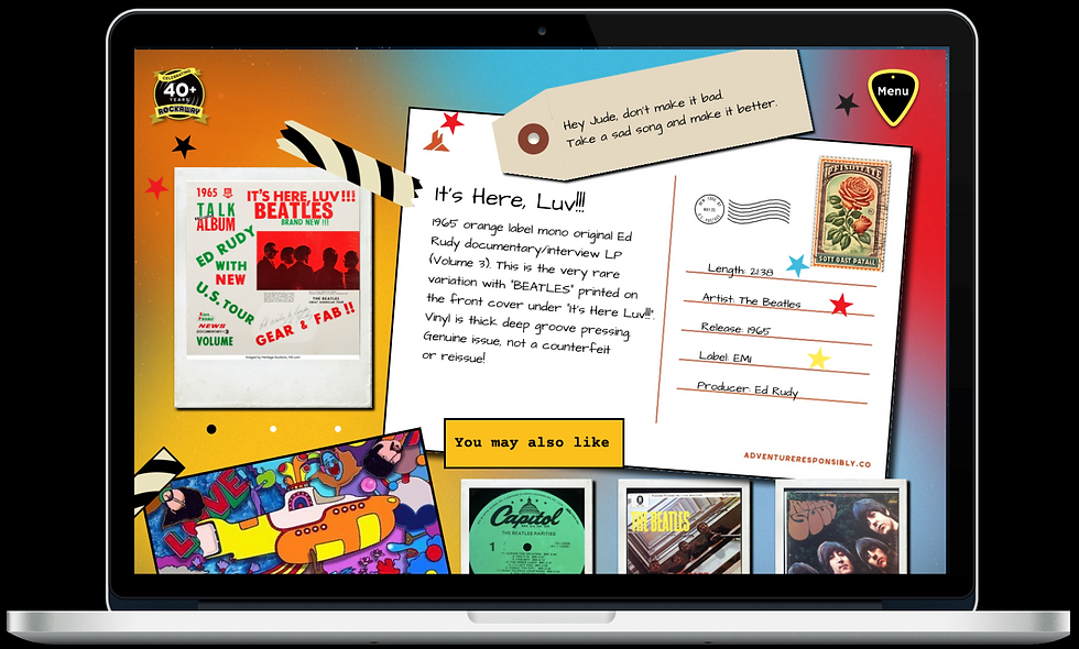
This new design shows more information of each individual records.
Menu Page


Menu/Close icon inspired by guitar pick design.
I used a vinyl as the background for a list of items to give a color contract. It is also perfect for the theme.
Artists Page


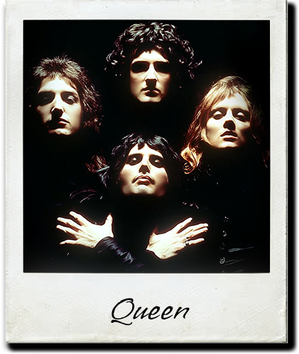
I redesigned interactive elements from collecting cards to Polaroids, so the style matches with the style of the next page . With a picture on the front and the information of artist/band on the back. This design creates a retro vibe. Added color change to the texts to indicate users can interact with them.
Records Page

I designed this page to mimic vintage scrapbook. All the merchandises were designed to mimic the look of Polaroid films. This makes the item list more interesting.
Detail Page


Font: Courier Prime
Font inspired by price sticker on CDs, Vinyls in stores.

Use the design to create a scrapbook feeling to the page. Added “Last page” and “Artists tab” so users can go back to previous pages if they want to.
bottom of page